Typography plays a crucial role in web design, influencing both aesthetics and functionality. In South Africa, the design landscape is diverse, necessitating a thoughtful approach to typography that resonates with local culture and enhances user experience. In this guide, we'll explore key principles of typography in web design, best practices, and how to create a typographic hierarchy that captures attention and ensures readability.
The Importance of Typography in Web Design
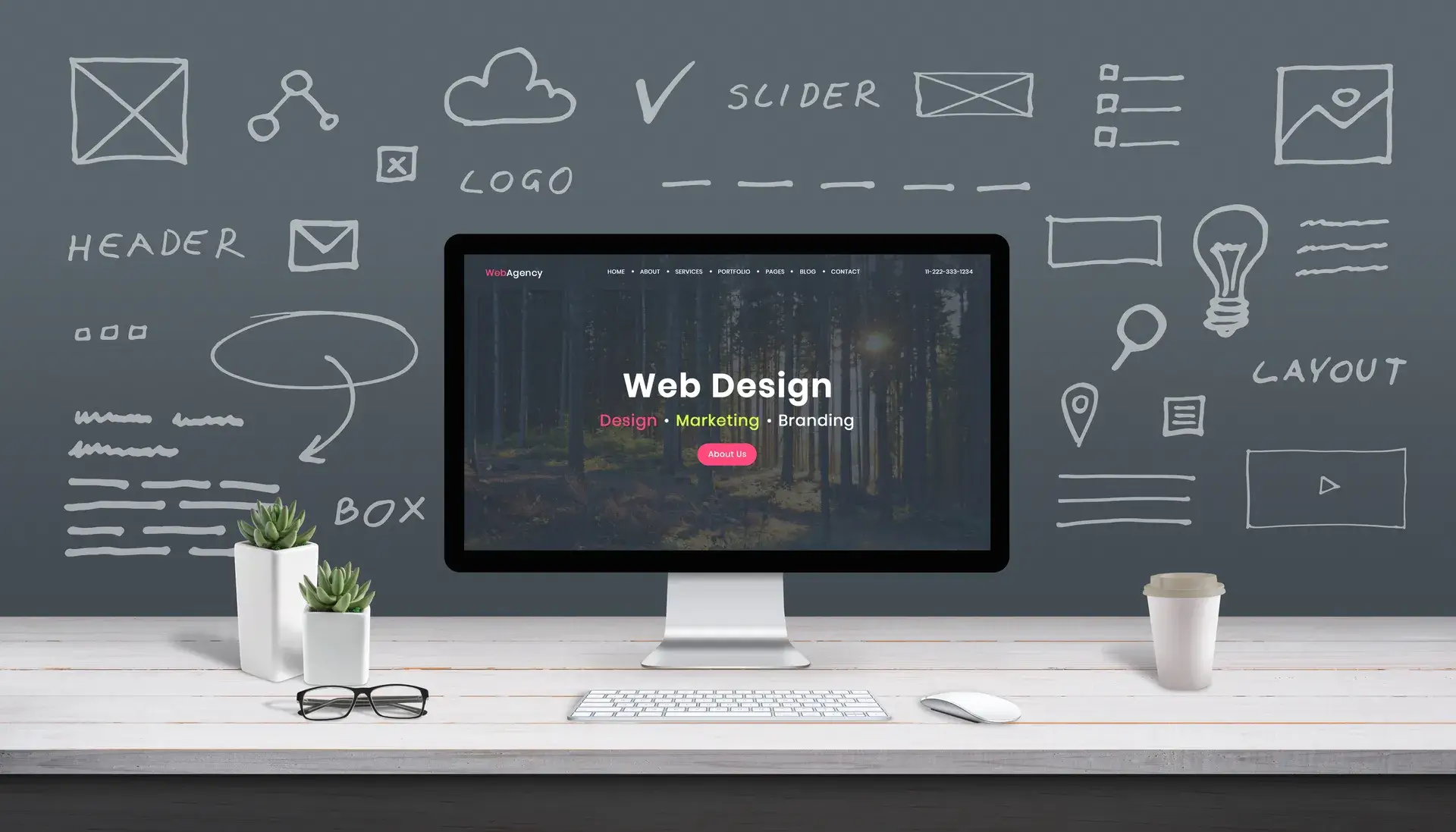
Typography is more than just choosing pretty fonts. It sets the tone of your website, impacts usability, and plays a vital role in branding. Good typography helps in:
- Enhancing Readability: Well-chosen fonts improve the legibility of text, making it easier for users to digest content.
- Establishing Brand Identity: Fonts can communicate your brand’s personality and voice, distinguishing you from competitors.
- Guiding User Attention: Effective typography can draw users' eyes to key information and calls to action.
Key Principles of Typography in Web Design
When designing for the web, consider the following typography principles:
1. Choose Readable Fonts
Select typefaces that are easy to read on various screen sizes. Sans-serif fonts like Arial and Helvetica are often recommended for body text, while Serif fonts may be more suitable for headings.
2. Establish a Hierarchy
Use different font sizes, weights, and styles to create a hierarchy. This helps users navigate content more intuitively. For example:
- Headings and Subheadings: Use larger, bolder fonts for headings to attract attention.
- Body Text: Maintain uniformity in body text size for better readability.
3. Limit Font Choices
Too many fonts can make a design chaotic. Limit yourself to two or three complementary typefaces to maintain consistency.
4. Pay Attention to Line Length and Spacing
Avoid long lines of text that can overwhelm readers. Keep line lengths between 50-75 characters, and ensure adequate line spacing (1.5 to 1.6 times the font size) for better readability.
Typography Trends in South Africa
South African design trends often reflect the country’s rich cultural diversity. Popular typography choices currently include:
- Bold, Experimental Fonts: Many web designers opt for bold type choices to express creativity and modernity.
- Local Influences: Designers often incorporate local languages and scripts, showing a connection to regional culture.
- Minimalist Typography: Clean, uncluttered fonts are favored for a sleek look that enhances user experience.
Choosing the Right Fonts for Your Audience
Understanding your target audience in South Africa is key to making appropriate typography choices. Research local preferences and industry standards to ensure your font selections resonate well.
Conclusion
Typography is a fundamental element of web design that demands careful consideration. By applying effective typography principles, you can create websites that are not only visually appealing but also user-friendly. At Prebo Digital, we understand the nuances of web design in South Africa, and we're here to help you develop a website that stands out. For professional web design services, reach out to us today and let's bring your vision to life!