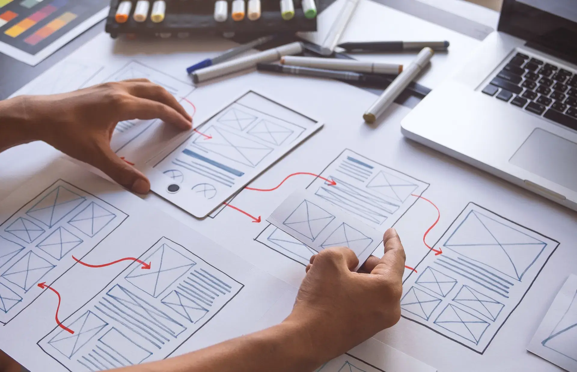
A well-structured web page layout is crucial for effective user experience and engagement. It not only conveys your brand's message but also facilitates smooth navigation. In this guide, we will explore various web page layouts, their benefits, and best practices to create an appealing website for your audience. Whether you're a designer or a business owner, understanding these layouts will enhance your web presence.
Why Web Page Layouts Matter
Web page layouts influence how information is presented and perceived online. A well-designed layout helps visitors easily consume content, improving user experience and potentially increasing conversions. Key benefits include:
- User-Friendly Navigation: Simplifies the user journey, making it easier to find information.
- Brand Consistency: Maintains a cohesive look and feel across all pages, strengthening brand identity.
- Enhanced Aesthetics: Visually appealing layouts engage users and keep them on your site longer.
1. F-Layout
The F-Layout is one of the most popular design patterns for web pages. It mimics the natural reading pattern of users, specifically in Western cultures:
- The eye follows an F-shape pattern, focusing more on the top left and gradually moving down the page.
- Key elements such as headings, CTAs, and images are placed along the 'F' lines to grab attention.
2. Z-Layout
This layout is effective for websites where users need to process a smaller amount of information:
- It follows a Z-shape path across the screen, from the top left to bottom right.
- Ideal for landing pages, it directs users to CTAs through strategic placement of elements.
3. Grid Layout
A grid layout utilizes rows and columns to organize content systematically:
- Offers flexibility in arranging various media types, including text, images, and videos.
- Perfect for sites showcasing extensive information, such as portfolio or news websites.
4. Card Layout
This trendy layout is characterized by individual 'cards' that contain bite-sized information:
- Cards can be easily rearranged and are responsive across devices, enhancing mobile usability.
- Commonly used in social media platforms and news aggregators.
5. Single Column Layout
This layout focuses on simplicity and clarity, presenting content in a single vertical column:
- Ideal for long-form content like blogs or articles, ensuring readers can easily follow along.
- Minimizes distractions, keeping the focus on the text.
Best Practices for Designing Web Page Layouts
To create effective web page layouts, consider the following best practices:
- Prioritize Mobile Responsiveness: Ensure your design adapts seamlessly to various screen sizes.
- Use Visual Hierarchy: Structure information to guide the user's eye where it needs to go first.
- Test User Interaction: Conduct usability tests to see how users interact with your layout before going live.
Conclusion
Choosing the right web page layout is vital for enhancing user experience and achieving your website's goals. By understanding different layout types and implementing best practices, you can create an engaging website that meets the needs of your audience. At Prebo Digital, we specialize in web design services that incorporate effective layouts tailored to your business objectives. Ready to elevate your website? Contact us today for a comprehensive consultation!


