In today's digital landscape, providing a seamless user experience across various devices is essential for businesses to thrive. Adaptive web design solutions are an innovative approach that ensures your website looks and performs brilliantly on any device, from desktops to smartphones. In this guide, we'll explore what adaptive web design is, its benefits, and how to implement it effectively for your business.
What is Adaptive Web Design?
Adaptive web design (AWD) is a methodology that creates multiple layouts for different screen sizes and devices. Unlike responsive design, which fluidly adjusts the layout based on screen size, adaptive design uses pre-defined fixed layouts that adapt when the site is accessed on various devices. This approach enhances user experience by delivering optimal layouts tailored for specific devices.
Benefits of Adaptive Web Design Solutions
Choosing adaptive web design for your website comes with numerous advantages:
- Improved User Experience: With dedicated layouts for each device type, users can easily navigate and interact with your content.
- Faster Load Times: Adaptive sites load quicker on mobile devices, as they often serve lighter, device-specific content.
- Enhanced SEO Performance: A well-structured adaptive design can improve your site's search engine rankings due to better user retention and engagement.
- Future-Proofing Your Site: As new devices enter the market, adaptive design allows you to create specific layouts that cater to these devices.
How to Implement Adaptive Web Design Solutions
Here are key steps to implement adaptive web design effectively:
- Assess Your Audience: Understand the devices your target audience uses to prioritize designs. Utilize analytics tools for insights.
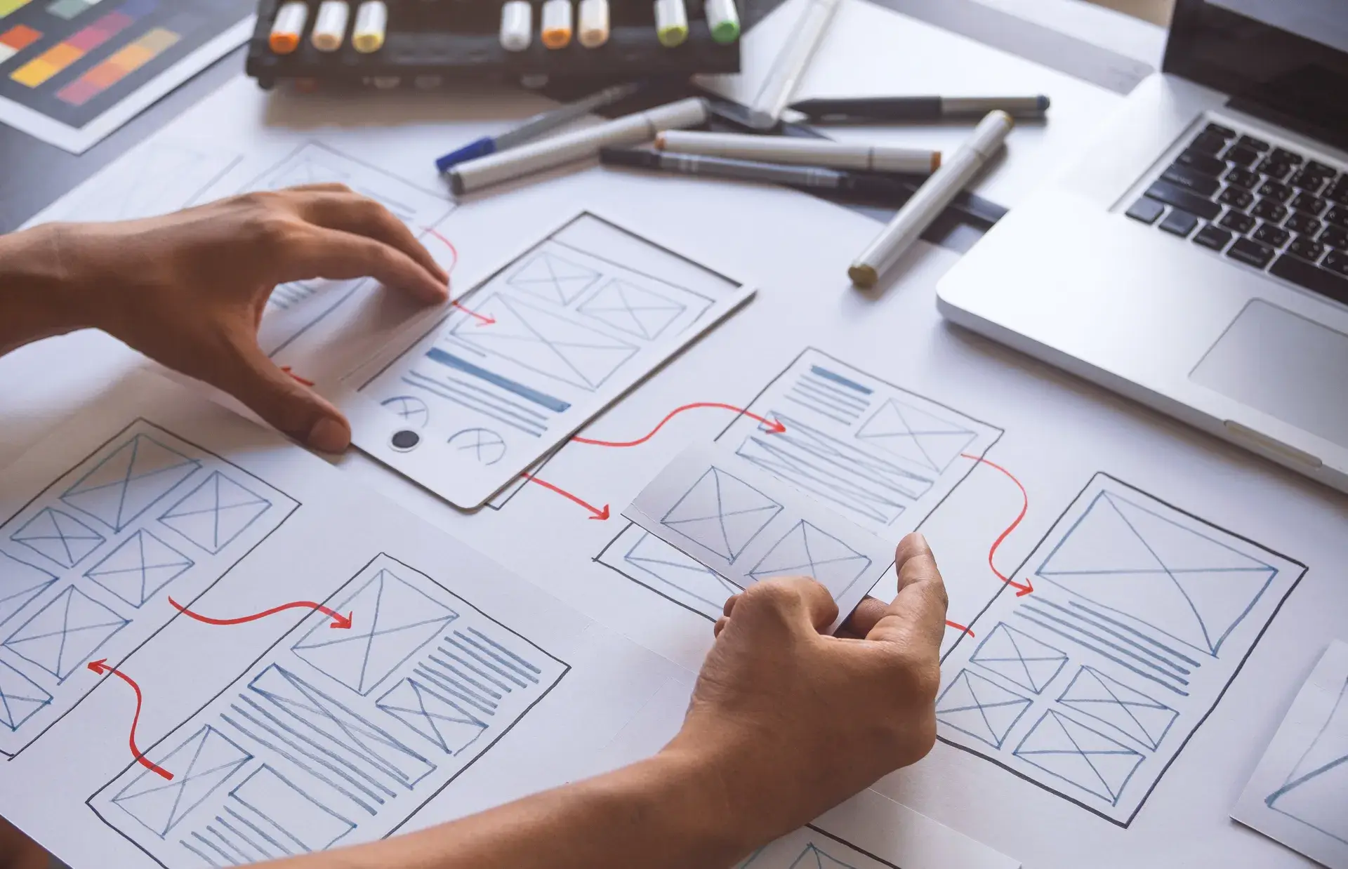
- Create Device-Specific Templates: Develop unique layouts for popular device categories (desktop, tablet, smartphone) to enhance user interactions.
- Optimize Content: Deliver relevant content based on the device type, ensuring smooth loading and viewing experiences.
- Test Across Devices: Regularly test your website on various devices and screen sizes to ensure that the adaptive design performs optimally.
When to Choose Adaptive Web Design
Adaptive web design is particularly beneficial for
- e-commerce websites with a diverse product catalog
- businesses with content-heavy sites like blogs and news portals
- companies targeting a global audience with varying device usage patterns
Conclusion
Investing in adaptive web design solutions can be a game changer for your online presence. By providing tailored user experiences for different devices, you not only enhance customer satisfaction but also improve your site's performance and SEO rankings. At Prebo Digital, we specialize in creating adaptive designs that are visually appealing and user-friendly. Ready to take your website to the next level? Contact us today for customized solutions!


