
Event posters are a vital marketing tool for promoting events and attracting an audience. They serve not only as visual communication but also as a representation of your brand. In this guide, we explore the essentials of designing eye-catching event posters in Johannesburg, ensuring your event stands out in a crowded market. We'll cover design principles, effective use of typography, and tips on color schemes that resonate with the local audience.
Understanding the Purpose of Event Posters
The main goal of an event poster is to grab attention and convey essential information efficiently. For an event in Johannesburg, your design should reflect the city's vibrant culture. Ensure your poster contains:
- Event Title: Make it prominent and easy to read.
- Date and Time: Clearly state when the event will happen.
- Location: Provide accurate address details.
- Contact Information: Allow potential attendees to reach you easily.
Key Design Principles for Event Posters
To create an effective event poster, consider these key design principles:
1. Visual Hierarchy
Use size and placement to create a visual hierarchy. The most important information, like the event name, should be the most prominent element on the poster.
2. Consistent Branding
Incorporate elements of your brand—such as colors, fonts, and logos—so that the poster aligns with your overall marketing strategy. This enhances brand recognition.
3. High-Quality Images
Images can significantly impact your poster's appeal. Opt for high-resolution images that are relevant to your event, and avoid using stock images that are not visually engaging.
Typography Tips
Typography plays a key role in effective poster design. Here are some tips:
- Limit Font Choices: Use no more than two to three different fonts to keep the design unified.
- Readability is Key: Choose fonts that are easy to read from a distance. Bold fonts work well for important details.
- Contrast: Ensure high contrast between the text and background to enhance readability.
Choosing the Right Colors
Selecting the right color palette is crucial. In Johannesburg, colors that reflect the local culture and vibrancy can help your poster stand out. Consider these points:
- Cultural Resonance: Colors that resonate with local audiences may enhance emotional connections.
- Color Psychology: Use colors that evoke the right feelings associated with your event. For instance, red can signify excitement, while blue evokes calmness.
Digital vs. Print
Ensure that your design works well for both digital and print formats. Consider creating a digital version for social media sharing and an eye-catching printed version for placement in strategic locations around Johannesburg.
Conclusion
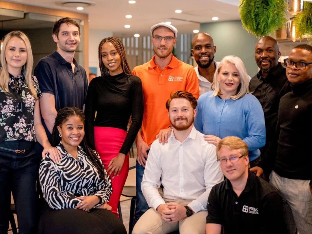
Event poster design is an essential aspect of successful event marketing in Johannesburg. By following these guidelines, you can create impactful posters that not only catch the eye but also effectively communicate the essence of your event. If you need professional assistance, consider partnering with Prebo Digital, your experts in graphic design and marketing solutions tailored specifically for your event needs. Let’s make your event unforgettable—contact us today!