
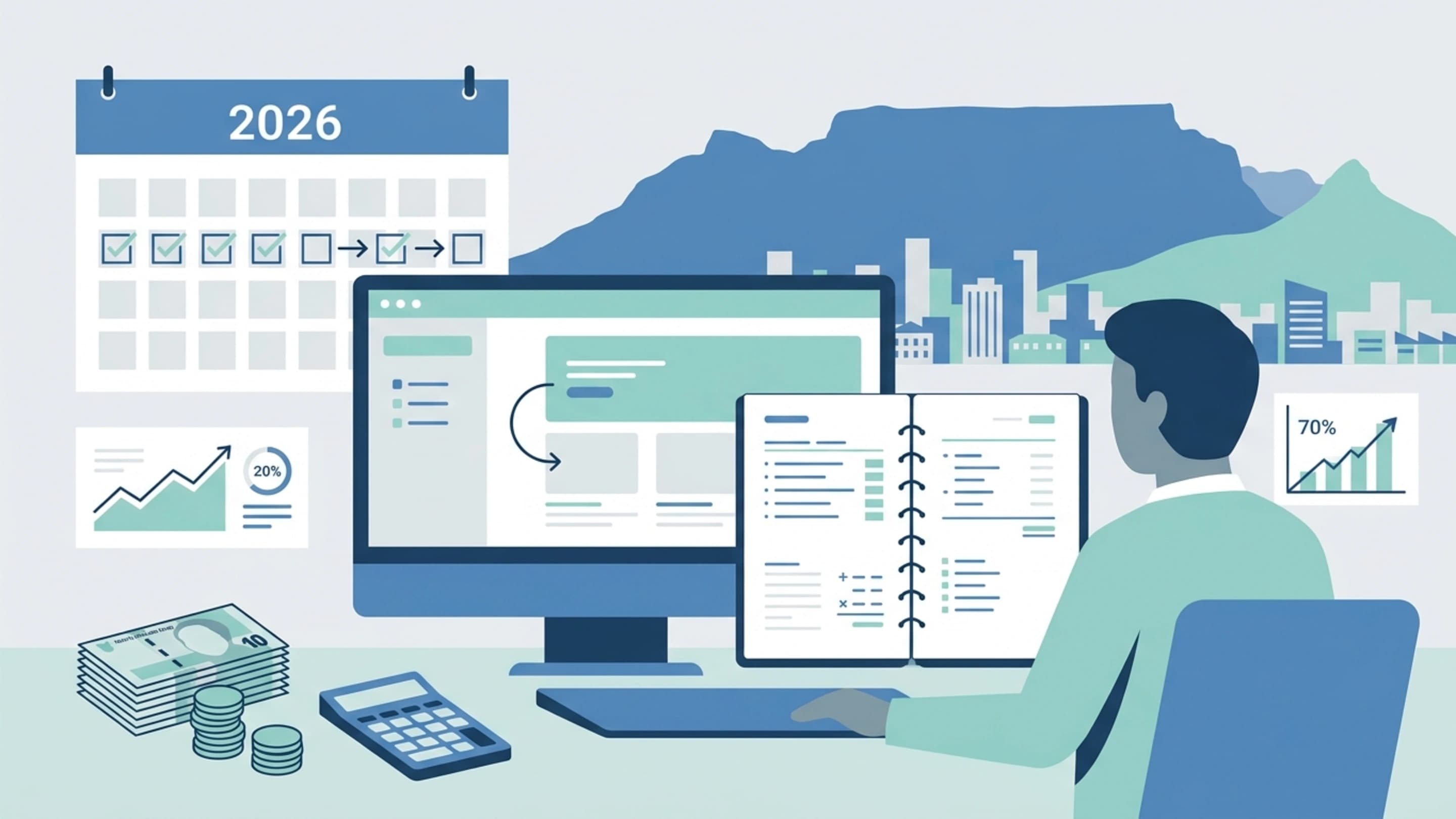
When the site looks polished but the pipeline still underperforms
A common business problem is not a broken website; it is a website that looks credible, loads acceptably, and still fails to move visitors toward action. That is where the difference between design and development matters. Website design shapes what people see, how they scan, and whether the brand feels trustworthy. Web development determines whether the experience is fast, stable, measurable, and easy to extend when the business changes. For a growing company, those two disciplines should not be treated as separate vanity projects. They should work together as a commercial system.
At Prebo Digital, the most useful way to think about website design and web development is through the user journey: what visitors need to understand quickly, what technical friction blocks them, and what evidence tells the business whether the site is earning its keep. That is especially relevant for South African brands and international teams that depend on clean attribution, mobile-first experiences, and conversion-focused journeys rather than traffic alone.
The practical test is simple: if you can explain the offer clearly, load the page quickly, and track meaningful actions accurately, the website is doing commercial work.
User-Centric design: what visitors need before they need a sales pitch
User-centric design starts with intent. A first-time visitor usually wants to know three things: what the business does, whether it solves their problem, and what to do next. Good design removes uncertainty by using readable hierarchy, clear navigation labels, enough whitespace, and visual emphasis on the next logical action. This is not about making a site minimal for style points; it is about reducing the mental effort required to move forward.
For service businesses, this often means placing proof and process near the top of the page. For product businesses, it means making value, pricing logic, and product comparison easier to understand. For B2B brands, it means making complex offers easier to scan without oversimplifying them. In every case, the design should answer questions faster than the competitor’s website can.
| Design choice | What it improves | Why it matters commercially |
|---|---|---|
| Clear headline hierarchy | Scanning and comprehension | Visitors understand relevance faster and stay longer |
| Focused calls to action | Decision-making | Reduces choice paralysis and increases qualified leads |
| Trust signals near conversion points | Confidence | Supports form fills, demo requests, and checkout completion |
The design process should begin with content structure, not colours or animations. In practice, that means mapping the primary page sections to user intent: awareness, evaluation, and action. Once the hierarchy is set, visual design can reinforce it through contrast, spacing, and predictable interaction patterns. That approach is more durable than trend-led design because it aligns with behaviour, not decoration.
Building technical foundations: what development must do behind the scenes
Development is where the promise of design becomes usable. A site can be visually strong and still fail because of slow rendering, messy templates, poor mobile behaviour, or tracking that breaks when users switch devices. Technical foundations include the front-end build, content management structure, server performance, image handling, accessibility support, and the measurement layer that feeds marketing and conversion analysis.
For Prebo Digital, the development conversation is never just about launching a site. It is about whether the site can support campaign traffic, content expansion, landing page testing, and reliable reporting. That is why development choices should be made with future growth in mind. A site that cannot accommodate new landing pages, new offers, or new analytics requirements becomes a bottleneck the moment performance marketing starts scaling.
A technically attractive site is not enough. If forms, events, and checkout actions are not tracked cleanly, the business cannot attribute revenue with confidence.
A useful development checklist includes performance optimisation, semantic HTML, accessible form states, image compression, caching, and a maintainable CMS structure. On more advanced builds, teams may also consider server-side tracking support, tag governance, and data-layer planning so analytics platforms receive cleaner inputs. Those choices are not abstract technical extras; they influence whether paid media, SEO, and CRO teams can make reliable decisions.
| Development priority | Primary benefit | Typical business impact |
|---|---|---|
| Fast page rendering | Lower friction on mobile and desktop | More visitors reach key content and forms |
| Clean CMS architecture | Easier content updates | Marketing teams can publish without developer delays |
| Reliable event tracking | Accurate measurement | Better decisions on spend, UX, and funnel changes |
For businesses operating across channels, development also needs to protect consistency. A landing page built for Google Ads should inherit the same brand logic as the main site while staying focused on a single offer. That balance is easier to maintain when templates, reusable modules, and analytics naming conventions are planned upfront rather than patched together later.
Integrating design with marketing strategies without making the site feel like an ad
Design and marketing work best when they share the same brief. The website should not merely host campaigns; it should strengthen them. This means aligning page structure with keyword intent, building landing pages that match ad messaging, and creating navigation paths that support both discovery and conversion. It also means designing content blocks that help SEO teams surface relevant topics without cluttering the user journey.
At a practical level, marketing alignment begins with page intent mapping. Homepage content should clarify positioning. Service pages should explain the offer and proof. Blog or resource pages should answer research-stage questions and lead users toward deeper evaluation. If those page types are designed as separate silos, the experience becomes fragmented. If they are designed as a system, the site supports traffic acquisition and lead nurturing at the same time.
This is where Prebo Digital’s reporting and optimisation mindset becomes valuable. Design decisions should be evaluated alongside channel data, not in isolation. A button colour change is less useful than understanding whether visitors are dropping off because the page promise is unclear, the form is too demanding, or the offer is misaligned with the traffic source. Marketing and design become far more effective when they share the same measurement framework.
The strongest websites make campaign promises feel consistent from the ad click to the final conversion step.
Responsive design: making the experience work on every screen
Responsive design is no longer a nice-to-have because mobile traffic is often the first and most frequent encounter with a brand. The goal is not simply to shrink the desktop layout. It is to rethink how content, forms, and navigation should behave when space is limited and attention is divided. Buttons need enough spacing to tap accurately. Key messages need to appear early. Long forms need progressive disclosure or fewer required fields.
Responsive implementation also affects trust. If menus break, images overlap text, or forms are difficult to submit on a phone, the visitor reads that as a signal of operational weakness. By contrast, a stable mobile experience supports credibility before a sales conversation even begins. For businesses with longer sales cycles, this is especially important because mobile research often happens before desktop conversion.
A well-developed responsive system typically includes fluid grids, flexible media, device-aware breakpoints, and content prioritisation rules. The aim is not to create separate versions of the same page; it is to design one coherent experience that adapts gracefully. That is the difference between a site that merely fits and a site that performs.
Measuring success: which metrics show the website is pulling its weight
A website can feel improved and still underperform commercially, so measurement has to move beyond subjective feedback. The most useful metrics depend on the business model, but the core question stays the same: are more qualified visitors completing meaningful actions? For service businesses, that may be enquiry forms, booked calls, or downloaded briefs. For e-commerce, it may be add-to-cart rate, checkout completion, and revenue per session. For B2B teams, it may be demo requests, document views, and assisted conversions.
Prebo Digital’s reporting approach is rooted in clean attribution and practical business interpretation, not vanity metrics. That means looking at traffic quality, conversion rate by landing page, scroll depth on critical sections, device splits, and form abandonment. When these signals are read together, they show whether the design and development work is improving performance or simply refreshing the surface.
| Metric | What it tells you | Why it matters |
|---|---|---|
| Conversion rate | How effectively pages drive action | Shows whether design and messaging are aligned |
| Page load performance | How quickly users can engage | Impacts bounce risk and mobile usability |
| Form completion rate | Where users drop out in the funnel | Helps prioritise UX fixes and field reduction |
| Assisted conversions | How content supports later actions | Useful for longer consideration cycles |
If a site has healthy traffic but weak conversion, the issue may be message mismatch, poor hierarchy, slow performance, or a form that asks for too much too soon. If conversion is strong on desktop but weak on mobile, the problem is often layout prioritisation or interaction friction. Measurement should be used to isolate those patterns, not to collect more dashboards.
Real-world outcomes: what changes usually move the needle
The most visible business improvements from better website design and development usually come from removing friction rather than adding novelty. Clearer landing pages can improve lead quality because visitors self-select more accurately. Better mobile responsiveness can reduce abandonment because users no longer fight the interface. Cleaner development can make marketing more agile because new pages and tests can be deployed without waiting on major rebuilds.
Consider a hypothetical South African professional services firm that receives traffic from search, referrals, and paid campaigns. The site already explains the offer, but the contact form is long, the mobile menu is cluttered, and the conversion path is spread across too many pages. A redesign would not begin with animations or visual flair. It would begin with simplifying the information architecture, tightening the service pages, and improving the form flow. The likely outcome is not just a nicer interface; it is a clearer pathway from interest to enquiry.
That same logic applies to product-led businesses. If product discovery, filtering, or checkout steps create uncertainty, users hesitate. If development supports clearer navigation, better search, and simpler transitions between stages, the business gains efficiency at the point where revenue is actually created. The takeaway is that design and development work when they reduce decision fatigue and implementation friction at the same time.
A strong website change is usually felt first in the funnel: fewer drop-offs, cleaner lead quality, and more reliable attribution.
Future trends in website design and development
The next phase of website work is moving toward more adaptive, data-informed experiences. That includes AI-assisted content workflows, modular design systems, stronger accessibility standards, and improved integration between analytics and the CMS. The direction is not about replacing strategy with automation. It is about making execution more responsive to user behaviour and commercial goals.
Expect more emphasis on content components that can be reused across pages and campaigns, rather than rigid page designs that are expensive to update. Expect stronger attention to privacy-aware measurement and first-party data capture as teams work around changing browser behaviour and consent requirements. And expect more demand for websites that support both brand storytelling and conversion without requiring separate digital properties for every channel.
For business owners and marketing teams, the future-proof approach is to build for flexibility. That means choosing design systems that scale, development structures that are maintainable, and measurement frameworks that remain useful as channels evolve. A website should be able to grow with the business instead of becoming the first thing that needs replacing.
Conclusion: what to do next if the website needs to work harder
If your current site looks acceptable but does not consistently support growth, the next step is not a cosmetic refresh. It is a structured review of how the site serves users, how the build supports speed and tracking, and how the page structure aligns with marketing goals. That review should identify the biggest friction points first: clarity, performance, mobile behaviour, conversion flow, and measurement integrity.
For many teams, the quickest gains come from refining the existing structure before pursuing a full rebuild. In other cases, the right answer is a more substantial redesign and development overhaul. Either way, the goal is the same: create a website that helps visitors understand, trust, and act, while giving the business the data it needs to improve over time.
If you are planning that next phase, the smartest approach is to treat the website as part of the growth system, not a standalone asset. That is where design and development stop being separate disciplines and become a commercial advantage.